Build your first component in patternplate
⏲ Time invest: 10 Minutes ––– 👩🎓 Level: Beginner
What to expect
In patternplate production-grade components form the backbone of your design system.
This means there will be coding and cooperation between design and engineering involved
while working in patternplate.
Don't worry, we will walk you through the entire process.
We will …
- … learn how to add a component
- … style a component with
CSS - … program simple behaviour via
JavaScript
You'll need
- ✅ You are all set if you followed along Guide: Getting Started
- ✍️ Text editor
- 📁 patternplate project (Getting Started Guide)
Create a new pattern
Let's improve the component library and add a Button component.
Open a new terminal window or tab, then procceed with the steps below.
Make sure you have
patternplaterunning onlocalhost:1337Create a new directory
buttoninlib.# In a new terminal window mkdir lib/buttonOpen a text editor and add a
package.jsontolib/button.# create "package.json" touch lib/button/package.jsonCopy the code below into
lib/button/package.json{ "name": "button", "version": "1.0.0", "patternplate": { "displayName": "Button" } }Create a
demo.jsfile atlib/button. The interface will update automatically and add Button to the components list.# create "demo.js" touch lib/button/demo.jsCopy the code below into
lib/button/demo.js.module.exports = { default: function() { // Nothing implemented yet } }
Click on the Button item to display its (still blank) demo canvas. Replace the contents of
lib/button/demo.jswith the code below:module.exports = { html: () => '<button class="my-button">My first button</button>', default: () => { // Nothing implemented yet } }module.exports = {html: () => '<button class="my-button">My first button</button>',default: () => {// Nothing implemented yet}}ℹ️ You might think: HTML in JavaScript. What is this, sorcery? Don't worry, you can place your HTML in distinct files (demo.html) just fine, too. The same goes for your CSS (demo.css). See Demos for details.
Saving the file signals the Button demo to reload automatically and display the
HTMLyou just added.
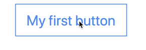
Let's throw some
CSSinto the mix. Replace the contents oflib/button/demo.jswith the code below:module.exports = { html: () => '<button class="my-button">My first button</button>', css: () => ` .my-button { padding: 10px 15px; font-size: 20px; background: none; color: cornflowerblue; border: 1px solid currentColor; }', `, default: () => { // Nothing implemented yet } }module.exports = {html: () => '<button class="my-button">My first button</button>',css: () => `.my-button {padding: 10px 15px;font-size: 20px;background: none;color: cornflowerblue;border: 1px solid currentColor;}',`,default: () => {// Nothing implemented yet}}Saving the changes will update your demo to look like this:

We'll wrap up this tutorial by adding some user interaction to the button. Let's count up when clicking on Button. Replace the contents of
lib/button/demo.jswith the code below:
module.exports = { html: () => '<button class="my-button">My first button</button>', css: () => ` .my-button { padding: 10px 15px; font-size: 20px; background: none; color: cornflowerblue; border: 1px solid currentColor; }', `, default: () => { const el = document.querySelector("button"); let count = 0; el.addEventListener("click", () => { el.textContent = "Clicked " + (++count) + " times." }); } }
Click the button to see our program in action
Take aways
Demos are the entry to components
demo.jsandpattern.jsonorpackage.jsonare required to display a componentdemo.jsprovidesHTML,CSSand JavaScript via thehtml,cssanddefaultexportsℹ️ Traditional multi file components work, too. See Demos for details.
Changes on source files cause demos to reload automatically